Where do we have unused (potential) political power?
One of our priorities was to support DPI organizations in co-creating questions and analyses that are most helpful to their immediate work. To this end, we helped a number of groups that were interested in mapping the terrain in their state to better understand the geographic dispersion of their base (or their potential base), identify which voters they were reaching that other campaigns were not, and refine their political strategies in a high-stakes election year. Other groups prioritized analyses of the voter demographics of their state, and how they changed over time.
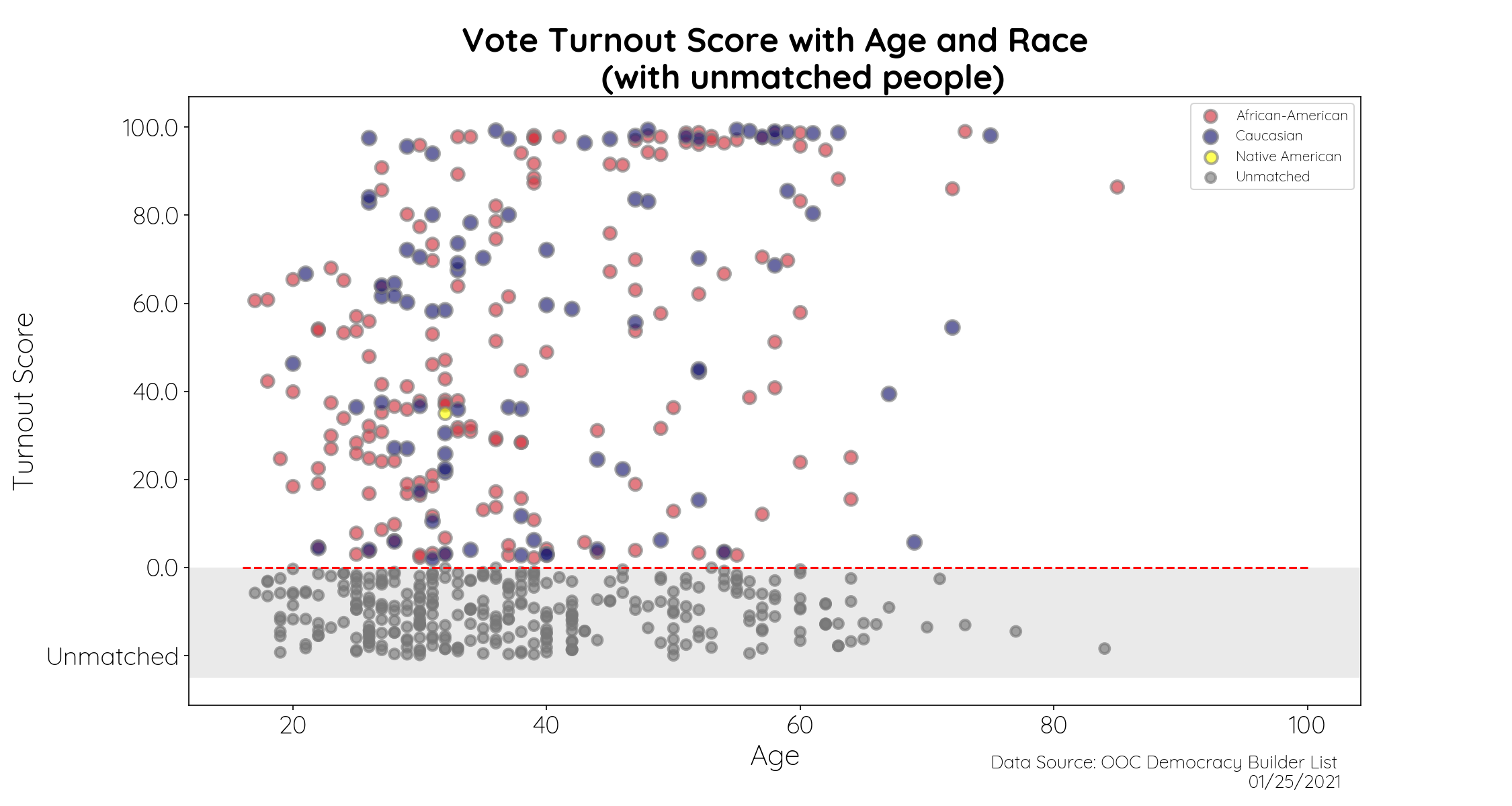
Ohio Organizing Collaborative | Missing voters
Demographics and modeled turnout score of voter contacts (including unmatched voters)

This is one of the most important visualizations we did in 2020. It is an analysis of relational voter outreach lists built by volunteers with the OOC, the majority of whom were young and/or Black. It showed that 80% of people on these lists are what the OOC calls “missing voters,” those who either don’t show up on the voter file because they’ve moved or not registered, or people who are marked with such low vote propensity scores in the voter file that they are unlikely to be targeted by political campaigns.
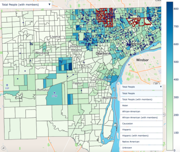
Detroit Action | Registered voters who did not turnout
Map of voters in the Detroit area who were registered but did not vote in 2016

In this layered map, dark blue dots represent Detroit Action members, and the shade of the precinct reflects its percent POC. Whereas existing efforts focused on the red-outlined precincts, after seeing this map it became clear that there were Detroit precicnts with a high density of both members and potential POC voters that they should seek to engage as well.
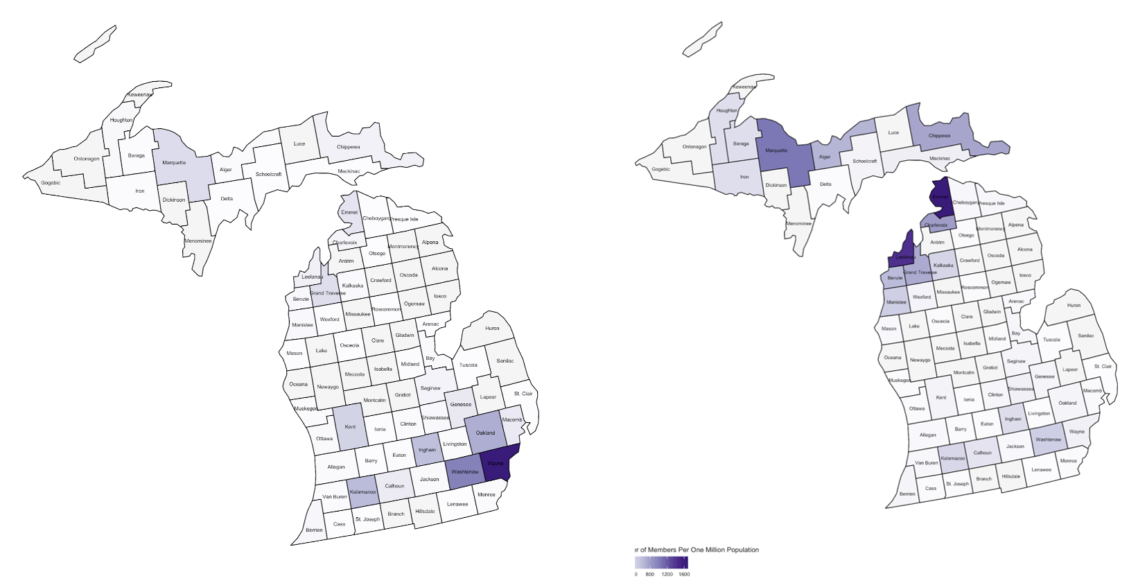
We The People | County-level analysis of membership
County level map of WTP members, shaded by per capita density

A map for We the People showing that while most of their members are in the Detroit region, per capita they have more membership outstate.
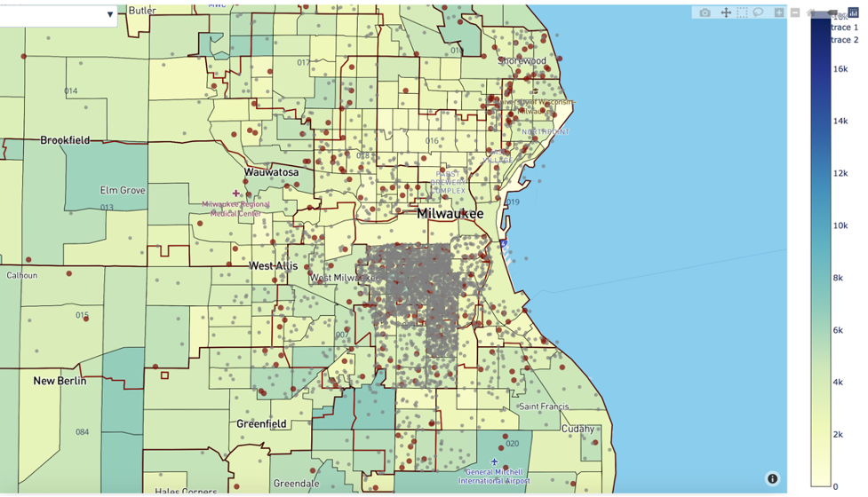
Voces de la Frontera | Distribution of Latino population and membership
Latino population of Wisconsin and member data (red = active, grey = inactive)

This map helped the VDLF team see where they have latent membership that they could reactivate in addition to recruiting new members.